Thursday, August 23, 2012

I'm still pluggin' away...

Geez, it's been a long time since I blogged!  It's been a busy summer.  And the heat and humidity just suck the life out of me.  During one of the heatwaves the temperatures finally dropped.  I didn't realize how cooped up I felt until I went for a walk and actually thought I'd been given freedom from jail!  I guess it's the same as cabin fever in the winter.
I've finished my postcards for Round 15 of Postmark'dArt.  I signed up for a 'no theme' hoping I would find a theme that would invigorate me.  I hadn't been in the sewing room for a while and followed my own advice of 'Just get in there.'  It doesn't matter if you sit and stare at the walls, just get in that studio.  Maybe tidy up a bit, put a few things here and another thing there, finding a 'I've been looking for that' type of thing and before you know it you're picking up something you want to do something with. 
I just decided to start pulling some fabric and get going on the postcards.  At first I tried not to look at a color theme, but eventually I couldn't help myself.  I picked a bit from my big bowl of cheap poly threads and experimented.  It would have been really easy to just cut the plate into straight rectangles but I'm just a lopsided kind of girl...  The top two are only straight because I decided I couldn't use that big blue twist of yarns and threads and there wasn't enough room to cut them crooked.

And I got a binding done.  The request was to match the binding to the 1/2" inner border.

It looks cool!

Friday, June 22, 2012

Cup Cozy and Pin Ring

For many years now I haven't bought any patterns.  I just follow my own path. 
At the MQ Quilt Show and Conference last week this pattern caught my eye...who doesn't have extra coffee mugs laying around?
And I don't even drink coffee!
The pattern is called Sewing Cup Cozy by Country Fabrics and Quilting in Brainerd MN.
It doesn't take much fabric, it's quick to make and uses some pretty buttons. Next time I'm going to stack a few buttons and 'make a new button'. 
It does require a skinny hair binder, which I don't have.  I even tried using some of that shiny elastic cording but it shreds apart easily.
But this week Rainbow Grocery Store has their hair accessories B1G1 and they have hair binders that are about 1" across and in over 20 colors.  Poifect!
Inside the cup cozy with the pins sticking out of it is a finger pin cushion that Barb Collins made at Wapo and gave to a few of us.  She said it's in a fun book called "100 Pretty Little Things".  It fits right on your finger and it's soft.

Sunday, June 17, 2012

Foshay Tower

For Postmark'dArt trade themed "Cityscape" I want to do something with the Foshay Tower, built in 1929 and back then was the tallest building in the Mid-west.
In the early 60's when my Mom moved "to the Cities" (as said by the people who live in Minnesota but don't live in the cities) she said it was still the tallest building, and it was until the IDS tower was built in 1972. Today it's crowded in by taller buildings.

I thought I could find a picture of a postcard of the Foshay from the 1930's and print it on the fabric and then an identical picture from now on a sheer and over lay it.  I've run into stumbling blocks every since that thought!
First I found all sorts of pictures online. Printed them out. Sorted them by copyrighted and no-identification copyright. I'm not too worried about the copyright of a 70 year old postcard but of the copyright of the person who put it on the web (if you ask they often give permission).
Most angles were from high up. And although I know I'm not too shy to go into buildings asking if I can obtain a shot, I knew an angle from the ground would be easiest for me to figure out. The 'ugliest' postcard picture of the lot was from the ground and from 1971. I found 2 buildings in it that are still existing. I bet that only about 10% of the buildings from the 30's still exist today. Mpls and St Paul are called the Twin Cities, but St Paul has retained her historic buildings and Mpls has torn hers down.

So a couple weeks ago, while still having the dream of obtaining my self-proclaimed May 31 deadline, I went downtown to at least obtain the 'ugly' postcard picture.  I brought the paper copy of the picture I had printed and went to see what I could do.
After seeing I was at the exact right spot but I wasn't going to get the same shot because of my camera lens (see how the building above is leaning?), I tore away the sky so I could hold the image up and see how off it was...I'm sure people thought I was nuts standing on the corner concentrating intensely on tearing a piece of paper.
So I was excited after this, not having a complete plan, but at least having some 'parts' to put together.
I bought the postcard image online.
I printed the postcard image on fabric and then fused that to the peltex. I drew all the lines of the buildings on and then stitched over the outlines of the buildings. Because I drew it on, each one is a little different.

In the original postcard there are several other things that are the same.  While standing there taking photos a bus drove by in the same place as the bus in the picture.  The dark brown lamp posts are the same even though the light fixtures changed.  At first I was disappointed that the one way sign was gone, because it still is a one way street.  But then I saw the sign sitting on the ground against the traffic signal lamp pole.  It is beat up but I don't think it's 40 years old.
It was a fun process and I want to do the same for some other structures in downtown Minneapolis, but on a larger scale.
Maybe some day!

From the observation deck in 2006:  Isaac

Thursday, June 7, 2012

"Peace" is a wise word.

Finally I get to post something!  "My 'peace' piece."
 I've been working on different projects every evening and all weekends, but everything takes so long to complete.  So: Hurray!
It's not like this has been some last minute challenge; I've known about the Minnesota Contemporary Quilters "Words of Wisdom" Challenge since last summer.  One of the hardest parts for me is coming up with my plan.  What inspires me?  I think the word Peace is a wise word.  Not too many of us can figure it out, and spend our whole lives not figuring it out.  It didn't take me long to know how I wanted to do it and since the entry form was due back in April, it was at that time that I had to decide the size. 
I knew I wanted blocks of grey for the background.  I printed the 5 letters in outline on paper for a pattern...I can't remember what font size this was but they are about 6 inches tall. 
Often at MCQ meetings Mimi Holmes brings handwork to do.  She sits there cheerfully putting stitches on her surface using embroidery floss.  She uses all sorts of colors and gets a fabulous effect.
So that is how I was inspired to get my word on my piece.  You can see in the picture above that the fabric in the middle of the photo is grey with black and white stitches, yet the grey looks like a darker shade behind the black stitches than it does behind the white stitches.  Optical illusion!
Peace can mean different things to different people but to me the quote "The only thing necessary for the triumph of evil is for good men to do nothing" stirs deep in me.
Bullying has to stop.  If we can't teach kids to stop bullying how can we expect them to know how to deal with it when they are adults?  Little bullies turn into big bullies.  And intimidated kids turn into intimidated adults. 
An easy solution is to teach kids to all come to defend another child when they are being bullied.  Safety in numbers and the power of the people!  Evil cannot triumph when good men do something!
And then there is some poor, mentally unstable kid who is so unsatisfied with his life that he already gets satisfaction from hurting others.  I don't believe that is easily solved but it can be solved.
To me "Peace" is black and white.  You're either for it or you're against it.  There is no thin grey line.
The entire grey background of my piece is only an optical illusion.  We've accepted that there are all these "grey areas".  If anything is grey to me, it is the millions of solutions that are possible.  For peace the only thing that matters is black and white, and that forever changes the illusion of the grey areas. 

Monday, June 4, 2012

More bindings...


Minky is hard to see where your stitches go!

Saturday, May 12, 2012

Postcards completed and starting

Above is 5 of the 7 van Gogh cards I mailed.  The top one is my favorite, and it is also the most literal interpretation of the painting.
Below is the new postcard project.  The theme is Cityscapes and I'm working on the Foshay Tower.
Mom said when she moved to Minneapolis the Foshay Tower was the tallest building in Minneapolis.  As you can see, that's no longer the case.  I think I'd like to find out just exactly how close that building is to the Foshay Tower.
An old photograph of the Foshay Tower.  

Sunday, May 6, 2012

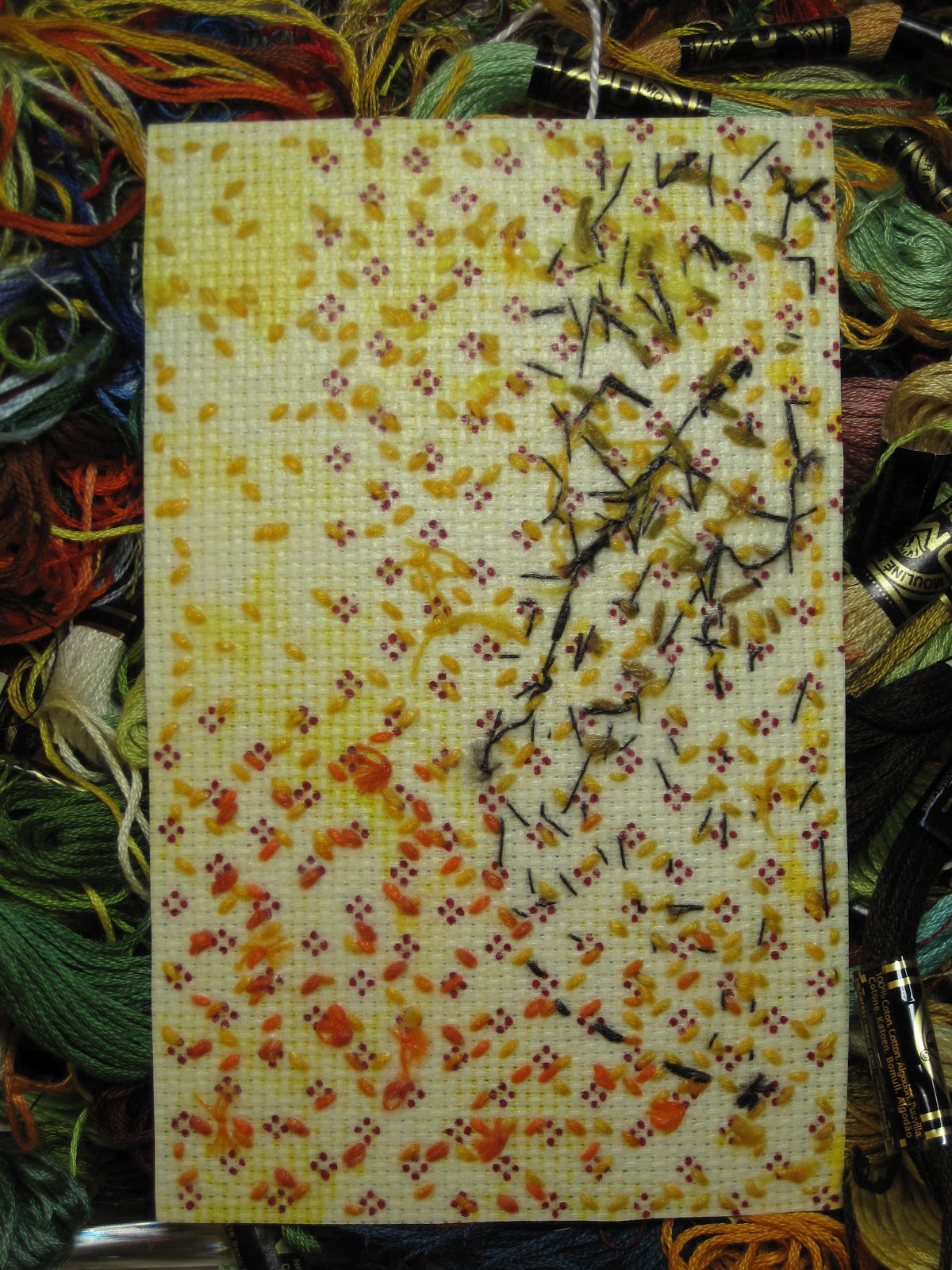
Vincent van Gogh Les Alyscamps

In the van Gogh theme PostmarkdArt trade I am finally finished stitching my cards.  Two are waiting for the liquid stiffener on the back to dry.  All cards were due April 30.  Note to self: "Next trading round do not sign up for 4 trades, no matter how fun they could be".
 All of the cards look different.  Some have the sky put on, but that didn't give me the effect I wanted.
I made them with counted cross stitch cloth (aida cloth) that was laying around and embroidery floss.
20 years ago I loved doing little cross stitch things, and now...well, these cards kinda say what I feel about cross stitching today!
I painted the cloth first.  I started out using some painters markers, which worked excellent, not changing the hand of the cloth, but they stink to high heaven.
Then I changed to acrylic paint, watered down.  It didn't work well, but I didn't want to poison myself with the other pens.  The main problem was the paint would clog up the holes in the weave.  I had to switch from a rounded point needle to a sharp point needle and poke my way through paint some times.
Then I just started stitching.
I also started out by marking the 4" x 6" size on it and started stitching with 6 strands of embroidery floss.
[That reminds me of a quilt show I went to years ago in Idaho, someone had tied their quilt with real dental floss!]
Eventually I wanted a stitch going around it and when I started doing the typical needlepoint stitch I immedately had some type of PTSD from whatever project I last cross stitched.  It's just no fun to stitch in an orderly fashion!
I made a few cards where I didn't do that outer stitch, I just stitched the picture up to my 4 x 6 lines.
After stretching them and putting the liquid stiffener on them I decided I didn't like it.  I stretched them in a quilting hoop so that when I put the stiffener on them  it would dry straight, but they went crooked anyhow.
So the last one I again put a needlepoint stitch around the edge and it didn't feel as painful as the other times.  I guess I got used to it.
The picture below is the back of one of the cards.  I didn't want a lot of thread on the back, so every time I stitched down into the fabric, when I came back to the front I only moved one hole over.  The exception is the trees and all their branches, I had to make a mess.

There's also those red dots all over.  Those are not stitches!  They were preprinted on the fabric for whatever the kit was that this fabric came in.  You can also see where some of the yellow paint seeped to the back in blotches.  All the aida cloth came from other cross stitch kits so that can be considered recycling, and the embroidery floss would have been the same, but making all the van Gogh cards I ran out of yellows.  So some of the yellow is newly purchased. 
All in all, I would make these again.  Each one takes hours but I love the effect.

Monday, April 23, 2012

My van Gogh cards are driving me insane...

Sunday, April 15, 2012

Remove Google Chrome!

It worked!  I removed Google Chrome and now I can post.
I guess they'll have to make some updates before I get to look at that fabulous site again.
http://www.googleartproject.com/
Which is 30,000 pieces of art from museums all over the world, photographed with such clarity that you can zoom in and see the cracks in the paint!
It's beautiful.
In the mean time, I'm still working on postcards.
This is one of my cards in the No Theme catagory.  It's "Stamps go round the world".  I've always loved stamps and I can envision that they will soon be extinct.  I mailed them last Saturday.

And I continue to work on my van Gogh theme using Les Alyscamps for my inspiration.

I don't know if the rest of the conversation was any good, but at Target I heard one sentence of it between 2 young guys:
"You couldn't do anything to me, ever, that would get me to use the wrong deodorant".

Tuesday, April 10, 2012

Let's see if I can post now!

I've had a problem being able to sign on to my blog to post. I just get a white screen.
I just went searching online to see if others had this problem and what was done to fix it.
The initial answers were to find out if you're using ie, firefox, etc.  And they recommended to download the new Google Chrome.
But now it came to me, because I recently downloaded Chrome so I could see this awesome site: www.googleartproject.com
And I've had the problems since then.
So I opened firefox and I couldn't directly get to this point, but I eventually got here.
So this is a test.

Sunday, April 1, 2012

I have been working on my postcards every evening.

For the Postmark'dArt trade for Van Gogh, I feel most intrigued by his style of paint stroke; impasto.
I wanted to interpret this with embroidery floss, 36 or 72 strands together to help create the feeling of impasto.
 It's really more of a study, since I haven't gotten down to one type yet.
He painted lots of fields, but the one above isn't mailable.
 I really wanted to do something with starry night, but it's not working for me.  Partially because there isn't enough shades/colors in embroidery floss, and partially because I only wanted to do a section but this just looks like a mastectomy.  When I was starting this one I had been looking at the piece at http://www.googleartproject.com/ and was amazed to see that he didn't paint the entire canvas, he left spots of the canvas unpainted when it contributed to the overall look.  At first I was trying to replicate that, but the more I futzed with it, the worse it looked.
 I also love Les Alyscamps.  The trees full of fall color appear to be on fire in his painting.  So I was inspired to do the one above.  But when I was done I did the one below.  Unfortunately all I see in the one below is a big blue tornado.  Or a river falling over a dam.  The blue takes over the yellow, believe it or not.  Plus I shouldn't have used the stitch going vertical.
I put stiffener on the backs of all of these, so they'd hold up in the mail.
I'll just keep working on them, but in the end I'll probably just make more of the yellow one, with one row of trees.  But can I ever just do the simple thing?  I wish!  There's lessons learned in each one.

Saturday, March 10, 2012

Murphy's Law

When I was making my Steam Punk postcards for the trade at http://www.postmarkdart.com/ I spent a lot of time searching for the parts, trinkets, images, etc, that I wanted to use.
I went to thrift stores looking for medical books about the heart to take apart so I could use the pages,  I looked for gadgets that I could take apart...and some cheesy quilting related item for a gift exchange with Cave Women.
The results weren't very good.  But I had fun looking at everything and found some other things I didn't want to live without.  Like a brand new, still sealed, set of paint pens.

Last week I stopped at one of the same thrift stores and I found a medical book exclusively about the heart with lots of images, wind-up clocks to take apart for parts and a cheesy little metal sewing machine that was a pencil sharpener.

Apparently God and the universe heard my wishes but they had more important things to do and I was near the bottom of the list.  Which, of course, is right where those types of wishes should be.

Friday, February 24, 2012

Trusting or letting go.

My steampunk cards in the PostmarkdArt trade are ready to mail.  Addressed, stamped, signed, sealed, delivered...I'm yours.  Whose am I?

I've been hesitant about sending out something that I spent so much time on.  I spent hours on the cards but even more hours on my quest to find what I wanted for them.  It was all fun of course, but if the recipient doesn't receive them, well, that would suck the joy right out of it.

So if it gets lost in the mail, that means someone else would have my little piece of art, right?  Well, isn't that still nice, that someone else liked it enough to steal it?  (I believe that's a Federal Offense!)  Someone else wants to enjoy looking at it?  I should be so honored.  Or not?

Today I carefully covered them with removable painters tape.  As I was taping them I felt foolish.  It is suppose to be postmarked art after all, and what challenge is it if I cover it up?  It's not exactly postmarked art if I send it in a box.  Isn't that the same as covering it up?  If I ordered a shirt from a website and when I receive it in the mail, does that mean it's postmarked shirt art?

If I just trust in the Universe, that the card will go where it's suppose to go and if where it goes isn't where I wanted it to go then what?  I was mistaken?  I was presumptuous to think what I want matters to the Universe?  I was dumb enough to not understand where it really was suppose to go?

Or should I worry more because I'm going on and on worrying about something that hasn't even happened and may not happen?

OK. You're right. Tomorrow I will put them in a mail box.  And I will let go.

Saturday, February 18, 2012

It's been a long time since I posted!  But that doesn't mean I haven't been doing 'stuff'.
I have spent wayyyy too much time on my Steampunk postcards for PostmarkdArt.
Way too much time on something that could get lost in the mail.
I spent so much time driving around to get my 'parts' for the cards.  Luckily for me Archivers had a nice selection of steam punk and some of them were actually gears!  It looks like most of the other postcard traders also bought the same gears.  I spent time at Home Depot, many thrift stores, JoAnns, Michaels, etc.
I wanted gears, things to take apart, cheap books that had medical 'stuff' in them.  I wanted the type of medical books that have the clear plastic pages showing the different parts of the body.  I found one that only had the whole body.  But I still bought the book and ripped it apart.
So I gave up on that and decided to print my own.  Thankfully in my old couponing days I got free samples of 3M transparency sheets because when I looked for them at the office supply stores they are $60 for the smallest box!
Then I was looking for a copyright-free heart.  I spent way too much time searching the internet, and Dover Publishing.  No luck.  So these 6 hearts belong to some text lesson somewhere.
I printed the heart on the transparencies.  I wanted a blood red fabric for the background.  But then the transparency didn't show up. 
So I also printed the heart on photopaper, cut it out exactly, cut out the center, and colored the white edges to match the heart.  Putting that behind the transparency was perfect. 
I arranged my assorted gear paraphanalia so that it would fit in the cut opening of each of the 6 postcards.
I glued, then handstitched every little gizmo down to the red fabric, backed by interfacing.  I also cut apart the copper sheets I embossed and painted in my previous post.  I glued down the photopaper hearts.
Each postcard will still have timtex (pel-tex) in it I had to cut the center out to accomodate the thickness the gears and 'stuff' were adding to the postcard.  Since each of the 6 cards gears are different I had to cut out each one to match.  I never do anything the easy way!  I fused the red fabric with all the stuff on it to the tim-tex.  For the written side of the card I fused light blue fabric.
Then taking the medical textbooks I added a page and tore out where the heart goes.
Now to assemble them!
Lining up wasn't as difficult as I thought it would be, but pounding the eyelets was.  The plastic and metal form you use to pound the eyelets with wasn't fool-proof.  Every one had to be checked and then hammered again to even it up.   I think it said something about 'pound lightly'...are you kidding?  I had to pound the crap out of it!
Then I trimmed them to 4 x 6" and I was relieved to be done!
Now on to van Gogh postcards: